Web Management + Brand Identity
HOW I CREATE CAPTIVATING DIGITAL EXPERIENCES
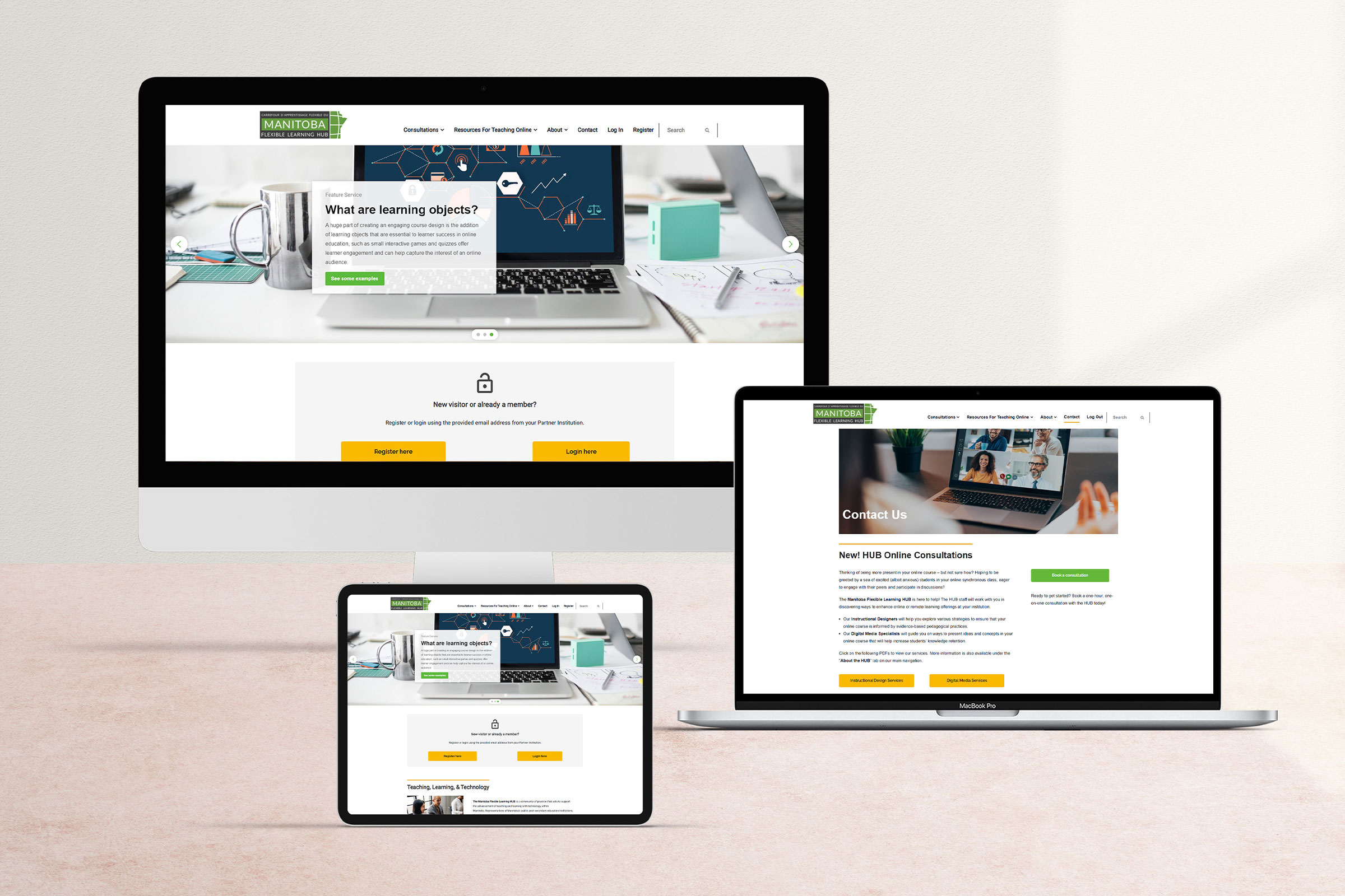
The Manitoba Flexible Learning HUB was a community of practice dedicated to advancing teaching and learning through technology in Manitoba. For the HUB’s website, we created a distinctive brand identity that set it apart from our established post-secondary partner institutions.
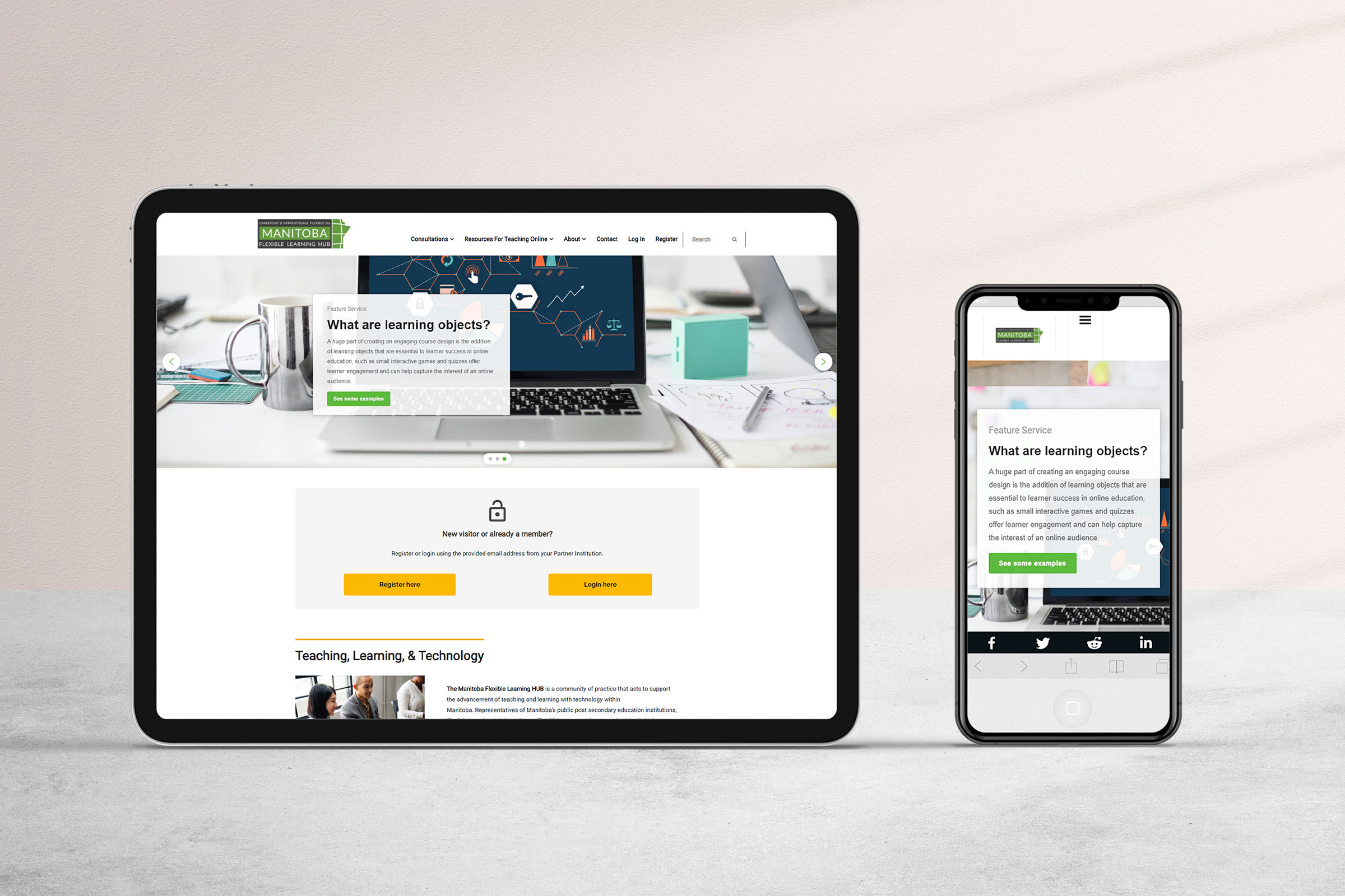
Our design had to be fully responsive and accessible, enabling educators to access resources from anywhere, anytime, especially during the onset of the 2020 COVID-19 pandemic. We developed a user-friendly interface with simple navigation that allowed educators to easily locate relevant resources, while also ensuring that the design was flexible and adaptable to meet changing needs.
The result was a visually stunning, easy-to-use website that supported the HUB’s mission to empower educators and transform learning experiences.
Pre-Production
To meet the needs of our Manitoba Flexible Learning HUB community, we identified a range of features and resources that would enhance the website’s functionality and support the advancement of teaching and learning with technology.
We created exclusive resource pages that could only be accessed through a login from a recognized partner institution email address, along with social sharing tools, LMS course framework downloads, and support resources for both D2L Brightspace and Moodle.
We also developed an online booking service for instructional and eLearning design consultations, workshop registrations, a course portfolio, and a blog to promote collaboration and knowledge-sharing among educators. Our work on the website began with a complete brand identity package, which provided the foundation for the design and development of the site.
The result was a fully customized and user-friendly platform that met the unique needs of our community and supported the HUB’s vision for transformative learning experiences.

Concept
The website design followed a sleek, minimalist approach that prioritized quick and consistent user interactions.
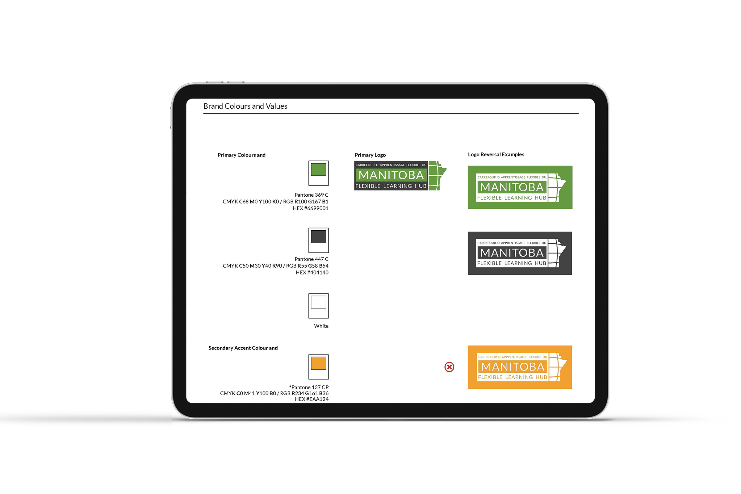
The brand identity was characterized by a bold color scheme that highlights essential features on the site.
Green, the pre-established color for the logo, was paired with a subtle charcoal shade to create a striking contrast and provide a stable foundation for the lively green hue. Additionally, marigold orange was introduced as an accent color to complement the overall aesthetic.
The layout is composed of straightforward shapes and strategically guided by the vivid branding, ensuring user-friendliness.


Production
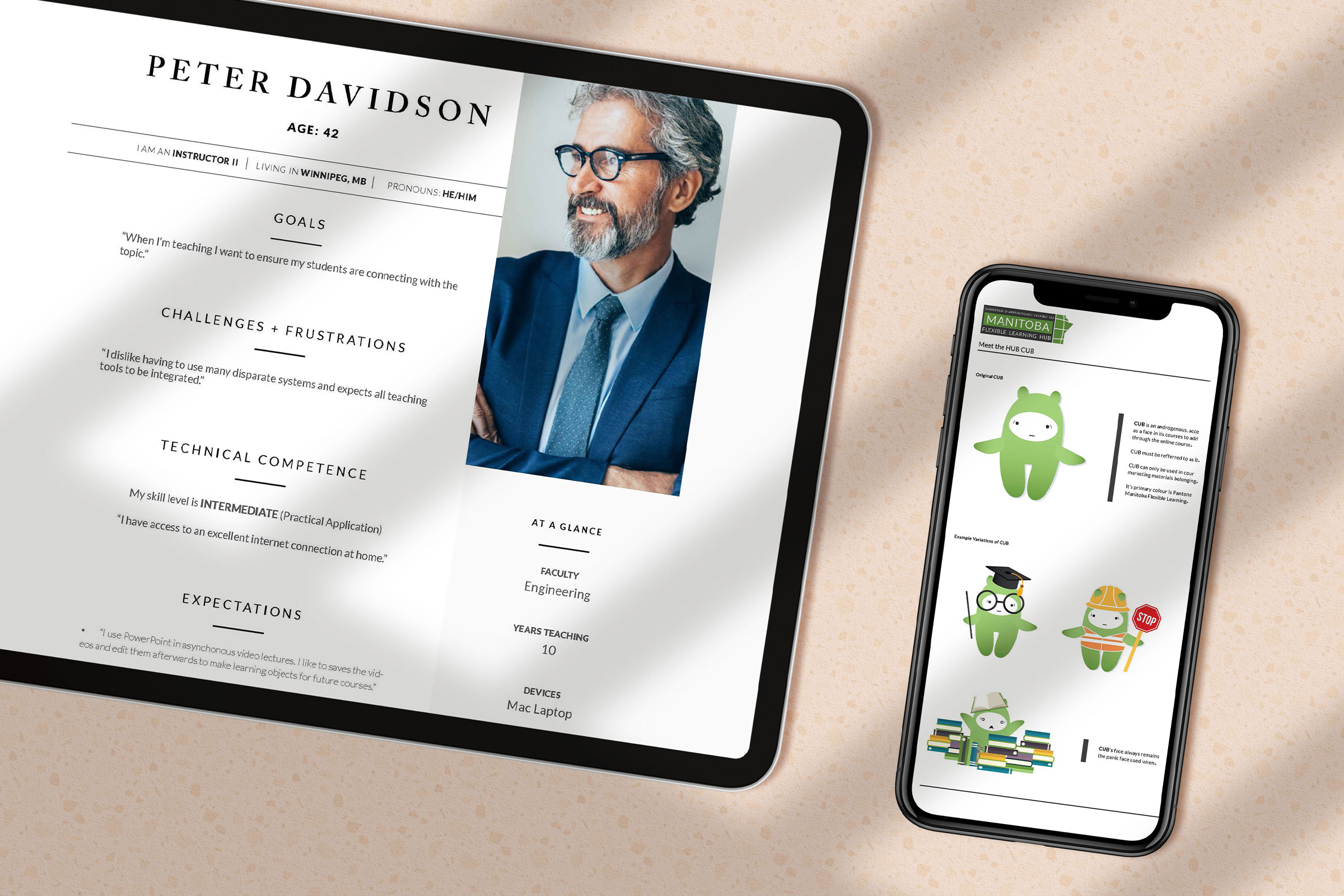
To ensure that the website would be tailored to the needs of our users, I started by developing personas that captured the potential use cases of our diverse audience. These personas informed our brand identity work, including the creation of an androgynous, emotionally accessible mascot named Hub Cub who would be featured in both our media and online courses.
Next, I designed a blueprint that supported the website’s multiple functions, including the need for a responsive, branded HTML template for instructors who would be able to download it and use it to design their own courses in the D2L Brightspace learning management system (LMS).
A template that included essential information such as a syllabus, copyright notice, instructor message, and a sample assignment page, was created with design restrictions to ensure stress-free implementation.
Final
Both the final Hub website and course frameworks were strategically designed to facilitate seamless communication and resource delivery between instructional designers and educators throughout every stage of the online learning development process.
The minimalist and vibrant design of the website and the frameworks ensures that they are both visually engaging and highly functional, encouraging user interaction and facilitating effective collaboration between team members.
